Dear Mrs Bird: A design story
AJ Pearce's debut novel Dear Mrs Bird, out now in paperback, is a love-letter to female friendship, London's Blitz spirit and the art of letter-writing itself. Read about the influences behind the cover of this very special book.

Set in London in the midst of the Second World War, AJ Pearce's debut novel Dear Mrs Bird - now part of the Richard and Judy Book Club-is a love-letter to female friendship, Blitz spirit, the kindness of strangers and the art of letter-writing itself. Here, Picador Publishing Director Francesca Main and Design Manager Katie Tooke share the story behind the cover of this very special book.
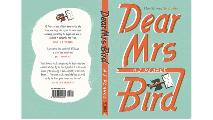
Francesca Main on the inspiration
Dear Mrs Bird is a book the whole of Picador fell head-over-heels for and one we feel sure will become one of the best-loved and most talked-about debut novels of 2018. So we asked for a truly stand-out design that hinted at the 1940s setting and would entice as broad a readership as possible (no pressure, Katie...). I hoped the cover would prove a dream to create as it's so evocative and full of wonderful visual imagery.
I wanted to leave as much as possible to the designer's imagination and not over-direct the choice of cover image (though I did put in a plea that we avoid the usual wartime fiction cliches). I felt it was more important for the design to reflect the tone of the novel than its subject matter. Dear Mrs Bird is original, warm-hearted, uplifting and fun - I hoped that the cover design would evoke these feelings inside and out.
Ultimately, I felt the best source of inspiration was the extraordinary treasure trove of 1940s magazines, letters, photographs and advertisements the author AJ Pearce had collected over the course of writing the book. Katie and I paid her a visit at home and spent a glorious few hours leafing through vintage copies of Vogue and Woman's Own, reading letters and diaries and giggling over ads for Bile Beans and wedding night advice. These things had led to a fabulous novel and it was a delight to see them lead, in turn, to a fabulous cover design . . .
Katie Tooke on the design process
I was lucky enough to get to go and look at AJ's beautiful collection of vintage magazine, posters, photographs and letters from the 1940s and 50s - the perfect design inspiration for Dear Mrs Bird. It was a hugely inspirational visit and seeing the material that AJ had used to research the book also sparked the idea for the design of the book cover.
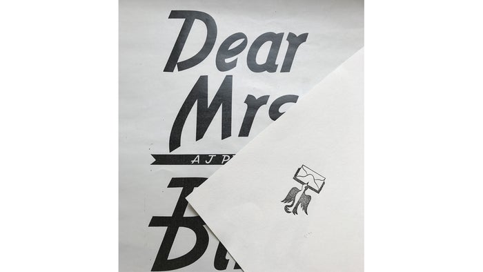
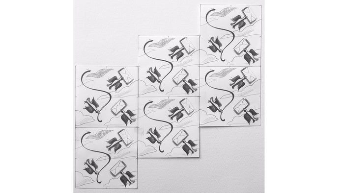
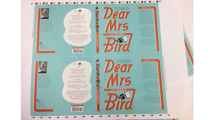
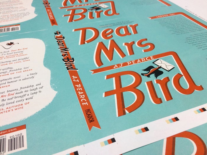
The typography that you can see above was inspired by fonts used on magazines of the time. The little bird icon was from an old advertisement from a 1940s problem page and seemed to perfectly sum up the story of Dear Mrs Bird. I roughly created the design in photoshop and then I asked illustrator Emily Sutton to redraw the bird and the typography. She expertly smoothed out any imperfections and set up the colour separation of the design. She also created a repeating pattern (which you can see above) for the endpapers, back cover and spine artwork. Emily then contacted letterpress and design printing studio Typoretum, who created the letterpress plates you can see below. These were used to print the proofs I needed to build the cover.
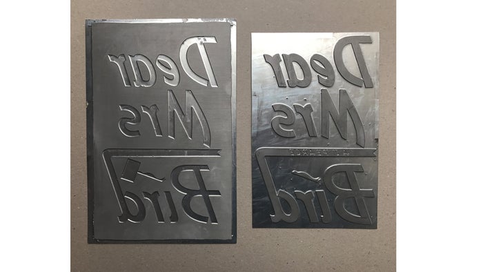
Once I had scanned all the separate elements, I could then layer up the artwork to create the cover and give it an authentic 1940s printed feel. The colours are typical of the decade and finished copies will be printed using pantones to enhance them for the feeling that is evocative of the period. The design is bold and simple and authentic in its rendering, giving Dear Mrs Bird a distinct and confident look that instantly transports you to the 1940s.
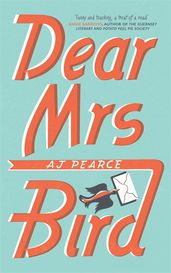
And here is the finished cover, almost ready to be sent into the world!
Dear Mrs Bird Finished Copy
Dear Mrs Bird
Set in London in 1941, Dear Mrs Bird is the story of Emmy and Bunty - best friends trying desperately to stay cheerful despite the Luftwaffe making life thoroughly annoying for everyone. Emmy dreams of becoming a Lady War Correspondent and when she spots a job advertisement in the newspaper she seizes her chance – but after a rather unfortunate misunderstanding, she finds herself typing letters for the formidable Henrietta Bird, the renowned agony aunt of Woman’s Friend magazine. This heartwarming, funny and thoroughly charming novel is a debut Sunday Times Bestseller and Richard & Judy Book Club pick.