The making of Station Eleven
Station Eleven, Emily St. John Mandel's beautiful, dark novel set in the days and years after the collapse of civilisation, has a cover to die for. The humble computer screen doesn't do justice to the fluorescent pink of Pantone 806 C which makes up the lettering of the title, so you'll have to look out for copies in the shops. In the meantime, we listened in on a conversation about the cover between Emily and Nathan Burton, who designed it.

Station Eleven, Emily St. John Mandel's beautiful, dark novel set in the days and years after the collapse of civilisation, has a cover to die for. The humble computer screen doesn't do justice to the fluorescent pink of Pantone 806 C which makes up the lettering of the title, so you'll have to look out for copies in the shops. In the meantime, we listened in on a conversation about the cover between Emily and Nathan Burton, who designed it.
Sent: Tuesday, 5 August 2014, 16:05
From: Nathan Burton
To: Emily St. John Mandel
Hi Emily,
I am interested in whether you had any ideas for the cover as the book is chock full of great visual images: pickup trucks pulled by horses, tattoos of knives on a wrist, a desolate airport.
Also, where did you get the idea that one of the characters would be a graphic novelist, are you a fan of graphic novels?
Best,
Nathan
Sent: Tuesday, 5 August 2014, 19:01
From: Emily St. John Mandel
To: Nathan Burton
Hi Nathan,
I love graphic novels. My interest in them has coincided with a moment in my life when I've been appallingly busy, and so I haven't managed to seek very many of them out, but the few I've read in the past few years have been wonderful. My first introduction to the form came some years ago, when a friend came to visit me and left a copy of Brief Lives, one of the graphic novels that Neil Gaiman wrote for D.C. Comics in the mid-nineties, as a parting gift. It struck me as a fascinating form, and a graphic novel seemed like the kind of project which a thoughtful and committed character could labour away at in solitude for years. Such a project seemed in keeping with Miranda's personality. [Ed.: Miranda is one of the characters in Station Eleven.]
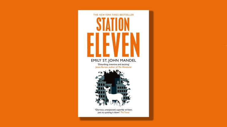
As for the cover, perhaps because I spent so much time thinking about what the caravans of the Travelling Symphony would look like – trying to figure out the approximate weight of an extended-bed Ford pickup truck with the engine removed, researching what size wheels such a contraption would require in order to be pulled by horses, etc. – I think I'd been imagining that the cover might depict one of these caravans, perhaps moving down an overgrown highway somewhere. That being said, I'm delighted by both the UK and North American covers, neither of which involve caravans. Nathan, what made you decide to go in the direction you did? I'm curious about how you came to the image with the deer and the overgrown city.
Best,
Emily
Sent: Wednesday, 6 August 2014, 13:33
From: Nathan Burton
To: Emily St. John Mandel
I love graphic novels too so the chance to work on a book that involved recreating Miranda’s story was a dream brief.
As for the cover, I guess I wanted to encapsulate the novel without being too specific to any one character or event. I tend to do a few thumbnail sketches before I start a cover but looking back through my sketchbook I only made one for Station Eleven which is pretty close to the final cover.

I liked the idea of a cityscape being taken over by nature and I thought it needed a central image to give the cover a focus point; a deer seemed a natural fit (wild but attractive). The novel opens with a theatre scene and the Travelling Symphony puts on Shakespeare plays so I wanted to give the illustration a stage set feel –the buildings could almost be cardboard cutouts behind the foliage vignette.
One of the things I really liked about the novel is how it moved forwards and backwards in time with these interconnecting characters. How difficult was it to pin down the structure of the novel? Did you always see it following that route?
Best,
Nathan
Sent: Friday, 8 August 2014, 16:09
From:Emily St. John Mandel
To:Nathan Burton
It's interesting to think of that cover as a stage set; it hadn't occurred to me, but now that I look at it, I definitely see it.
Yes, the novel was always going to follow the route that I took, with the interconnecting characters and the non-linear structure. I wrote my first novel in that fashion, and I just found it to be a fascinating and effective way to tell a story. I like telling a story from multiple perspectives because you get a fuller picture that way, and you can reveal things to the reader that your main characters might not know. I liked the idea of moving a narrative forward not toward a given point in time, but toward the moments of greatest tension or drama in the story, even if those moments occurred ten or twenty years apart in the timeline. I have tremendous admiration for writers who can stick with one point of view, and then carry that point of view steadily forward in a linear fashion for the duration of a novel. It's something that I'd like to do some day, but thus far I haven't managed to sustain it for anything longer than a short story.
I've been fascinated by jacket art for a long time, and something that I find particularly interesting is the way different covers work for different markets. When I show the UK cover to American publishing professionals, the response I get is usually along the lines of "Wow, you're right, that's really beautiful. Wouldn't work in our market, though." But no one I've talked to has been able to pinpoint exactly why this is, or what the precise differences are between the UK market and elsewhere. Have you ever had to design different covers for different markets, or do you have any thoughts on why some visual motifs that work in the UK apparently don't work elsewhere?
Sent: Monday, 11 August 2014, 18:58
From: Nathan Burton
To: Emily St. John Mandel
I'm not sure anyone really knows what the difference between the US and UK market is. I don't want to oversimplify and say that there isn't an aesthetic difference between US and UK jackets but within the genre of literary fiction I've always found them to be pretty similar, with some striking work coming from both sides of the Atlantic. I've designed a few jackets for US publishers and I approach the brief in the same way as a UK cover. Occasionally my UK jackets are used on the US version but it doesn't happen too often. There's no “right way” to design a jacket and it's difficult to know which covers are going to be successful, so I understand why a publisher wants to commission a designer from the start: they can have a bit more control and steer the cover in the direction they feel confident about. It's always fun to see how another designer has approached the same cover though!
What's next on the cards for you? Are you working on a new novel?

Sent: Wednesday, 13 August 2014, 15:21
From:Emily St. John Mandel
To:Nathan Burton
These days I'm still occupied almost entirely by Station Eleven-related activities – I'm typing this on a train en route to Baltimore, where the day's itinerary involves signing 3,000 copies of the book at a warehouse–but I started a novel a few months back that I've been thinking about more and more lately. I'm hoping to find some time to work on it while I'm on tour over the next couple of months.
And what's next for you? Have you been working on any projects that you're particularly excited about?
Sent: Thursday, 14 August 2014, 09:31
From: Nathan Burton
To: Emily St. John Mandel
And presumably, you'll be heading over to the UK to do more promotion?
I've always got a few book covers on the go but the project I'm most excited about is illustrating a children's book that my wife has written. It's just a case of finding the time between paying jobs to get started on it and also hoping that she doesn't fire me!
It's been great having a chat about Station Eleven as it's a book that I really enjoyed reading so designing the cover for it was a pleasure!
Sent: Thursday, 14 August 2014, 13:05
From:Emily St. John Mandel
To:Nathan Burton
Yes, I'm coming to the UK for ten days at the end of September / beginning of October, and very much looking forward to it. Several of my great-grandparents emigrated from the UK, but I've only been there once, very briefly, and am delighted to have the opportunity to spend more time there.
A children's book sounds like an absolutely delightful project. I will keep my fingers crossed that you don't get fired. It's been an absolute pleasure chatting with you, and thank you again for creating such beautiful work for Station Eleven.

A final copy of Station Eleven, designed by Nathan Burton. The image at the very top of the post shows the full cover –front, back, sides and flaps.
Station Eleven
by Emily St John Mandel

This book opens with an actor dropping dead on stage, and it only gets more surreal and dramatic from there. Emily St John Mandel has a real talent for combining the real and the unreal, and this book, set in the near future after a pandemic changes the world forever, is the perfect example of that.