The best poetry books to read right now
From the best poetry collections from much-loved classic poets to fresh and vital new poetic voices, these are some of the best poetry books of all time, introduced by poetry anthologist Allie Esiri.
Whether you’re looking to soothe your mind, ignite your inner rebel or make your heart sing, poetry offers something for every day and every mood. As Dylan Thomas said, “poetry is what in a poem makes you laugh, cry, prickle, be silent, [or] makes your toenails twinkle." Whatever your poetry is, below you'll find some of the best poetry books to read now.
Immerse yourself in dazzling collections from must-read modern poets, such as the award-winning Raymond Antrobus or Kae Tempest. Or pick up an anthology that showcases a curated array of the greatest poets from around the world and across time, and discover works from the likes of Maya Angelou and Lord Byron to W.B. Yeats and Benjamin Zephaniah. There are picks for younger friends and family too, with a selection of the best children’s poetry from classics to the present day.
The best modern poetry books and collections
Selected Poems
by Jen Hadfield
This collection showcases the vivid, elemental voice of Jen Hadfield, drawing from her award-winning body of work. Known for her close attention to the natural world and the textures of everyday life, Hadfield’s poetry is grounded in landscape, particularly the wild, windswept Shetlands she calls home. Whether celebrating the scrappy resilience of animals, meditating on solitude, or capturing fleeting sensory moments, her poems blend lyricism with a strong sense of place. Complete with previously unpublished material, Selected Poems is a generous offering from one of our foremost poets.
Wellwater
by Karen Solie

Both grounded and searching, Wellwater demonstrates a poet writing at the height of her powers. With precise and unflinching language, Karen Solie discusses themes of memory, inheritance, and the natural environment. She excels as a laureate of the transitory, and her roving, syntactically elegant poems will often resolve in disarming directness. Wellwater showcases an essential voice in modern poetry, offering a collection that speaks powerfully to our times.
Water, Water
by Billy Collins

Billy Collins has a way of noticing things most of us overlook; the quiet comedy in a cat drinking from a swimming pool, the strangeness of an astronaut quoting Emily Dickinson in outer space. In Water, Water he gathers poems that begin with the familiar and end somewhere unexpected. There’s joy and humour, but also a gentle awareness of absence – the way things vanish and the marks they leave behind. Whether tracing the outline of grief or marvelling at small absurdities, these poems offer a new way of looking a the everyday.


But & Though
by Jake Hawkey

From the hospital ward to the back rows of the bus, these are poems on the move through London, as we accompany a boy's journey through a childhood overshadowed by parental alcoholism. The characters that live and breathe in Jake Hawkey’s impressive debut poetry collection are playful and spiritual, often both defensive and desperately vulnerable. With a voice as spiky and irreverent as it is gentle, Hawkey is a refreshing new talent in English poetry.
An Arbitrary Light Bulb
by Ian Duhig

In An Arbitrary Light Bulb, Ian Duhig crafts a deeply personal collection that illuminates the beauty in life's randomness, drawing inspiration from the most ordinary and overlooked. The title, referencing a common yet nameless household bulb, becomes a metaphor for the anonymous lives and unsung moments that his poems celebrate. With his characteristic blend of wit, technical virtuosity, and emotional depth, Duhig moves between joy and grief – mourning lost loved ones while embracing the richness of everyday existence.
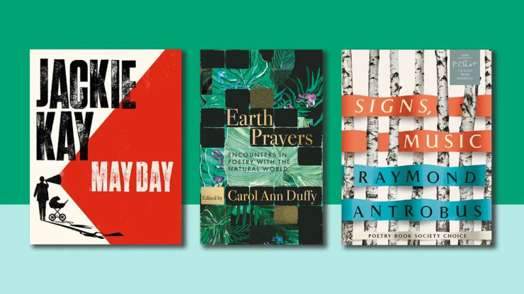
Signs, Music
by Raymond Antrobus
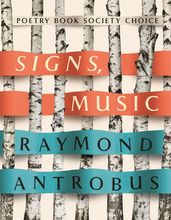
In Signs, Music, Raymond Antrobus meditates on his journey to becoming a father and the impact of losing his dad almost a decade ago, as he prepares for the birth of his son and the hypotheticals of parenthood become real. In two new lyric poems Antrobus is drawn into his past, exploring his fears of 'fatherly failure' and reflecting on how becoming a parent will alter his sense of self and his capacity to love.
The Keelie Hawk
by Kathleen Jamie
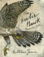
In a landmark Scottish publishing event, the current Makar (National Poet) of Scotland, Kathleen Jamie, presents The Keelie Hawk. For the first time, Jamie offers poems written in Scots, each accompanied by an English translation. In her afterword, Jamie reflects on how writing poetry in Scots allows her to celebrate and further the mother tongue of her homeland, musing that by doing so, she invites 'a language [to] develop'.
Earth Prayers
by Carol Ann Duffy

A celebration of the beauty and wonder of the natural world and our responsibility to steward and preserve it for generations to come, Earth Prayers is a collection of poems curated by former Poet Laureate, Carol Ann Duffy. Bound by their sense of the joy of nature, the importance of empathy and the celebration of difference, poets from centuries past and many still writing today join a call to arms to defend our planet and cherish it each day.


Divisible by Itself and One
by Kae Tempest
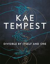
The powerful new collection from our foremost truth-teller Kae Tempest. Ruminative, wise, with a newer, more contemplative and metaphysical note running through, this is a book engaged with the big questions and the emotional states in which we live and create. Taking its bearings – and title – from prime numbers, Divisible by Itself and One is concerned, ultimately, with integrity: how to live in honest relationship with oneself and others.
Them!
by Harry Josephine Giles
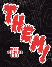
In Them! Giles excavates the lexicon of sex and gender, singing back with irony, fury and possibility. We hear from 'the reasonable people' and the bureaucrats; a bewildered worker contemplates the horrors of neoliberalism; a group of women at a quiet dinner encounter a punitive, spectral guest. Poetry, writes Giles, "is the best way I know to magic the rage I feel into something more alive, and to offer that spark to others." Drawing on an abundance of influences with subversive wit, Them! is a zestful poetic intervention from one of this generation’s most necessary poets.
May Day
by Jackie Kay
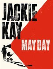
May Day is the long-awaited new poetry collection from one of our best-loved poets, Jackie Kay. These poems cast an eye over several decades of political activism, from the international solidarity of the Glasgow of Kay’s childhood, accompanying her parents’ Socialist campaigns, through the feminist, LGBT+ and anti-racist movements of the 80s and 90s, up to the present day when a global pandemic intersects with the urgency of Black Lives Matter. Also woven through the collection is a suite of lyric poems concerning the recent losses of Kay’s parents: poems of grief and profound change that are infused with the light of love and celebration.
365 Poems for Life
by Allie Esiri
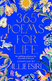
This uplifting poem-a-day collection is collated by the award-winning curator Allie Esiri and features poets both current (Ocean Vuong) and classic (Dylan Thomas). Find wisdom and wellbeing, and enjoy a quiet moment of calm every day of the year. The perfect gift for poetry lovers and newbies alike.
ISDAL
by Susannah Dickey
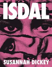
The much-anticipated debut poetry collection from acclaimed novelist Susannah Dickey, on the subject of our cultural obsession with true crime. The book is split into three parts: the first follows the flirty co-presenters of a podcast about the mystery of 'Isdal Woman', the second a philosophical enquiry into our perennial obsession with female victims, sexiness, and death and finally free verse poems that both explore and — perhaps inevitably— enact the ethical ambiguities of the genre. Witty, excoriating, formally ingenious, ISDAL marks the arrival of a thrilling new talent in contemporary poetry.
WHAT
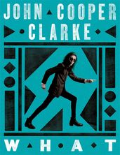
Dr John Cooper Clarke, the esteemed 'People's Poet', presents his dynamic new collection, WHAT. His influential voice, affecting generations of poets and musicians, takes aim at subjects including James Brown, John F. Kennedy, Jesus Christ: nobody is safe from the punk rocker's acerbic pen – and that's just the first poem. Vivid and alive, with a sensitivity only a writer with a life as varied and extraordinary as Cooper Clarke's could summon, WHAT is an exceptional collection from one of our foremost satirists.
And So This is Christmas
by Brian Bilston
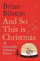
With his signature wit, Brian Bilston brings us fifty-one poems in celebration of the festive season: from bizarre family traditions to the office Christmas party; from voting day for turkeys to the impossible art of gift-giving.
Days Like These
by Brian Bilston
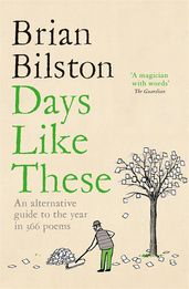
Days Like These will take the blues out of Monday, flatten the Wednesday hump, and amplify that Friday feeling. In this playful, innovative collection, Brian Bilston writes a poem to accompany every day of the year. Each poem is inspired by a significant – often curious – event associated with that day: from Open an Umbrella Indoors Day to the day on which New York banned public flirting; from the launch of the Rubik’s Cube to the first appearance of the phrase, ‘the best thing since sliced bread’.
Alexa, what is there to know about love?
by Brian Bilston
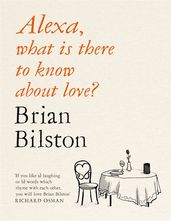
Alexa, what is there to know about Love? is a wonderful collection of poems about love in all its forms, covering everything from romantic love to familial love, to long-distance love, and even love on the internet. This collection from Twitter's unofficial poet laureate has a love poem for every time, place and occasion – and will stir the soul of even the most jaded romantic.
Selected Poems
by John Glenday
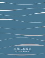
Scottish poet John Glenday largely writes short lyrics in English; his works are known for their precision and economy, but often shot through with a burbling surreal humour. He is a poet who grounds his work in fine observation and attention to both the natural and social world. This collection explores the elemental themes that are characteristic of his poetry, as well as bridging the distance between the familiar and unknown.
Orlam
by PJ Harvey
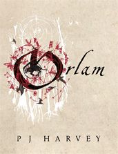
Orlam reveals P J Harvey as not only one of the most talented songwriters of the age but a gifted poet – whose formal skill, transforming eye and ear for the lyric line has produced a strange and moving poem like no other. A remarkable coming-of-age tale and the first full-length book written in the Dorset dialect for many decades, Orlam follows nine-year-old Ira who lives on a farm in the village of Underwhelem, next to the Gore Woods. Here, drawing on the rituals, children’s songs, chants and superstitions of the rural West Country of England, Ira creates the twin realm through which she can make sense of an increasingly confusing world.
Deep Wheel Orcadia
by Harry Josephine Giles
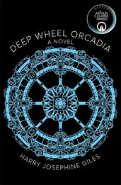
Deep Wheel Orcadia is a remote and failing space station that is struggling for survival as the pace of change threatens to leave the community behind. It is here that Astrid and Darling first meet – Astrid on her way home from art school on Mars and searching for inspiration, and Darling, fleeing a life that never fit, searching for somewhere to hide. The strikingly unusual sci-fi setting is mirrored in the unique form of this verse novel, which is written in the dialect of the Orkney islands, with a parallel English translation.
Somewhere Becoming Rain
by Clive James
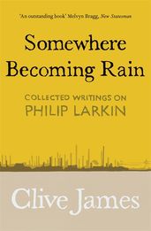
Philip Larkin was greatly admired by Clive James, and this book contains all of James' writings on Larkin one of the greatest British post-war writers – including some material published here for the first time. From Larkin's poems to his novels, and his jazz writing to his literary criticism, James meditates on the brilliance of the writing, and the complex and difficult personality of the man – a personality which sometimes threatened to obscure his genius.
‘This is the finest critic of his generation on the best poet of his lifetime.’
— The Times on Somewhere Becoming Rain
All The Names Given
by Raymond Antrobus
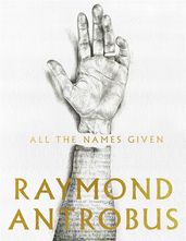
Award-winning poet Raymond Antrobus follows up his dazzling debut The Perseverance with All The Names Given, which continues his investigations into the nature of language, place, memory and poetic form. He begins with a meditation on his surname and the fraught history it carries, creating a space where the young poet can come to terms with his own ancestry. Travelling between England, Jamaica, South Africa and the southern USA, Antrobus muses on race and culture, the damage of colonialism, and the tender fragility of marriage.
The Wild Fox of Yemen
by Threa Almontaser
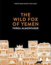
Winner of the Walt Whitman Award of the Academy of American Poets, The Wild Fox of Yemen is one of the most original and bold debuts in recent years. This powerful collection is both a love letter to the country and people of Yemen, a portrait of young Muslim womanhood in New York after 9/11, and an extraordinarily composed examination of what it means to carry in the body the echoes of what came before.
Hotel Raphael
by Rachael Boast
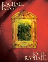
Hotel Raphael is Rachael Boast’s fourth poetry collection. Charting a journey through heat, drought and pain, it describes not only the reality of chronic illness, but living with it at a time of global crisis. Hotel Raphael sees Boast compose an extraordinary travelling song, one that shows us how to bear our pain without trying to erase its source.
The Stone Age
by Jen Hadfield
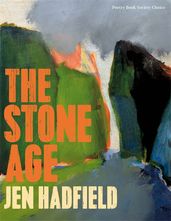
This new collection from the youngest woman poet to be awarded the T. S. Eliot Prize is a compelling depiction of the sublime potency and delicate subtlety of the natural environment, and more specifically her Shetland home. Her lines imbue a sense of careful power in the world she observes. From plant-life to the living rhythm of the rocks, hills and bogs that make up her landscape, Hadfield elevates the experience of the personal encounter, providing a timely meditation on the simple appreciation of the world as it is presented to us; nothing more and nothing less.
Hiddensee
by Annie Freud
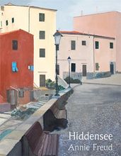
This upcoming collection from T. S. Eliot Prize-shortlisted Annie Freud is rich and multi-textured. Taking inspiration and aspiration from French-language Swiss poet Jacques Tornay, whom Freud identifies as a spiritual brother, the collection offers a refreshing, intriguing, and multi-linguistic approach. Freud’s work encourages exploration and confrontation of difficult truths, ranging between topics of illness and desire, crossing barriers of taboo and language and arriving at a wholly new way of thinking and expressing.
Wedding Readings and Poems
by Becky Brown
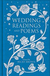
Part of the Macmillan Collector's Library, this newly curated anthology of romantic, funny, traditional and alternative wedding poems and readings for weddings is the perfect gift for newlyweds and wedding guests. Featuring classic poems from poets such as John Keats, William Shakespeare and Emily Dickinson, readings from best-loved classic books, and less-traditional extracts about the different facets of marriage, there's something perfect for every type of wedding, and couple, in this beautiful collectable clothbound collection.
Cannibal
by Safiya Sinclair
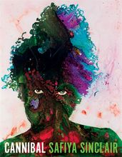
The poems in Safiya Sinclair’s debut collection bloom with an intense lyricism and fertile imagery that evoke the poet’s Jamaican childhood as they explore race, history, womanhood and exile. Colliding with and confronting The Tempest and postcolonial identity, Safiya shocks and delights her readers with her willingness to disorient and provoke.
My Darling from the Lions
by Rachel Long
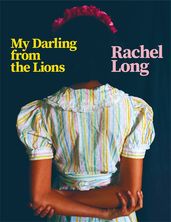
Founder of Octavia Poetry Collective for Womxn of Colour, Rachel Long’s much-anticipated first collection is an exciting showcase of her unique lyrical voice, tempered with dry wit and an unwavering political pulse. Long’s storytelling shines in this collection, as she explores ideas ranging from race and family to sexual and body politics. This collection is intimate and warm, her honesty disarming, and her poetic agility a joy to journey through.
The Problem of the Many
by Timothy Donnelly
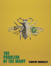
Timothy Donnelly’s poetry is sprawling, panoramic and unflinching in its delivery of philosophical insights on our modern age. The Problem of the Many, is a reference to a metaphysical conundrum that questions whether there are boundaries to ordinary objects, for example: there are many ways that a cloud can be made from many different water droplets. The poet’s work is gilded by his protean way with images and concepts; by stitching together a dense tapestry of facts he provides a fascinating and all-consuming new perspective on the human condition.
The Fire of Joy
by Clive James
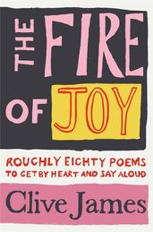
This highly personal anthology is a collection of Clive James’s favourite poems, poems which he hoped would inspire the reader to discover and learn, and perhaps even speak poetry aloud. Each poem is accompanied by a commentary from Clive which conveys both his enthusiasm and the benefit of his knowledge. Completed just before his death, his urgent wish was to share with a new generation the poetry that he had loved.
Whereas
by Layli Long Soldier
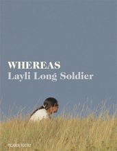
Layli Long Soldier is a citizen of the Oglala Lakota Nation. Her first poetry collection, Whereas, is a winner of multiple awards and offers a profound poetic engagement with public and political language. She orchestrates a lyrical response to the legislation, policies and apologies from the government of the United States with regards to the indigenous people of America. She explores these texts and provides a new way of thinking about their purpose and meaning through an array of poems. This collection beautifully exposes language’s deception and the predicaments of belonging.
‘In what is clearly a golden age for American poetry, Layli Long Soldier has to be out in front – one of the best collections of the century.’
— Andrew McMillan
Grimoire
by Robin Robertson
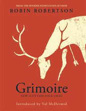
A grimoire is a manual for invoking spirits. Here, Robin Robertson and his brother Tim Robertson – whose accompanying images are as striking as cave-paintings – raise strange new forms which speak not only of the potency of our myths and superstitions, but how they were used to balance and explain the world and its predicaments. Haunting and elemental, Grimoire has the same charged beauty as the Scottish landscape – a beauty that can switch, with a mere change in the weather, to hostility and terror.
The Readiness
by Alan Gillis
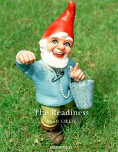
Belfast-born poet Alan Gilis in his Picador debut strikes out with a reassuring confidence crackling with dry wit. This collection explores themes that feel incredibly timely: the unsettled self, the disruptions and dislocations of society, the resilient beauty of nature in the face of human destruction and the overbearing presence of the digital realm. The Readiness is an inquiry into connection and disconnection, delving into the heart of the myths and confusions of modernity and finding truths to be shared within.
‘The godfather of British performance poetry’
— Daily Telegraph on John Cooper Clarke
Running Upon the Wires
by Kae Tempest
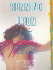
Running Upon The Wires is Kae Tempest’s first book of free-standing poetry since the acclaimed Hold Your Own. In a beautifully varied series of formal poems, spoken songs, fragments, vignettes and ballads, Tempest charts the heartbreak at the end of one relationship and the joy at the beginning of a new love; but also tells us what happens in between, when the heart is pulled both ways at once. Running Upon The Wires is a heartbreaking, moving and joyous book about love, in its endings and in its beginnings.
Insomnia
by John Kinsella
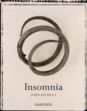
John Kinsella’s vivid and urgent new collection addresses the crisis of being that currently afflicts us: a situation where the creations of the human imagination – art, music and philosophy – suddenly find themselves in a world that not only denies their importance but can sometimes seem to have no use for them at all. In an attempt to find a still point from which we might reconfigure our perspective and address the paradoxes of our contemporary experience, Kinsella has written poems of self-accusation and angry protest, meditations on the nature of loss and trauma, and full-throated celebrations of the natural world.
The best classic poetry books
Poems for Love
by Gaby Morgan
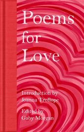
There has always been love, and we have been writing poetry about it for over 4,000 years. From John Donne and William Shakespeare to Emily Dickinson and Christina Rossetti, the very best classic love poetry is collected in this elegant anthology.
Songs of Innocence and of Experience
by William Blake
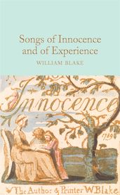
Including many of Blake’s best-loved poems, such as ‘The Tiger’, ‘The Lamb’ and ‘The Chimney Sweeper’, this beautiful edition of Songs of Innocence and Experience contains stunning reproductions of the illustrations that Blake etched himself to accompany the poems.
Selected Poems
by John Keats
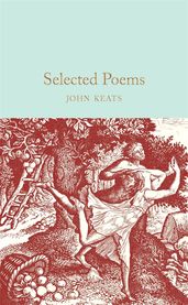
John Keats famously died at the tender young age of twenty-five, allegedly after having caught tuberculosis while caring for his sick brother Tom. He achieved much in his tragically short life; after abandoning his burgeoning career as an apothecary, he dedicated his remaining years to harnessing the poetic muse, and produced memorable works such as Ode on a Grecian Urn, and Ode to a Nightingale. This delightful clothbound, pocket-sized collection brings together a range of his odes and ballads, including poems published both during his lifetime and posthumously.
Poems of Thomas Hardy
by Thomas Hardy
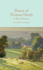
In 1896 Thomas Hardy, author of novels considered fictional masterpieces such as Far from the Madding Crowd and Tess of the d'Urbervilles, announced that he would no longer write novels, much to the dismay of his readers. He went on to write eight volumes of poetry; the best verse from each volume is brought together in this collection. Hardy’s poetry explores themes of grief, war, rural life and nature, and is often characterised by an earthy frankness and sincere reverence for being. This collection is a well-curated primer for those new to Hardy and those returning to his solid verse.
Leaves of Grass
by Walt Whitman
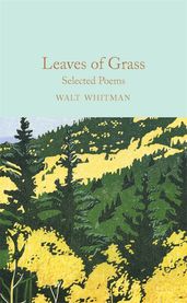
Walt Whitman’s poetry is sensitive, compelling and turbo-charged. The locomotives for his poetry are vast topics such as the state of the nation (his nation – the US) and the human condition. Whitman took inspiration from his travels through the American frontier, and challenged the form and thrust of modern poetry, laying the path for those who would follow in his footsteps and flesh out the American poetic canon such as Ezra Pound, William Carlos Williams and Allen Ginsberg. This collection, Leaves of Grass, was first published in 1855, and Whitman revised and expanded it throughout his lifetime.
A Golden Treasury of Irish Verse
by Lennox Robinson
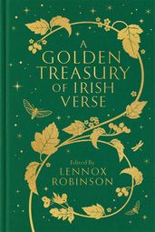
Originally published in 1925, A Golden Treasury of Irish Verse is an impressive and beautifully crafted collection of the best of Irish poetry from ancient times to the early twentieth century. It features folklore and legend, often beautifully translated from Gaelic with contributions from William Congreve, Thomas Moore, Moira O��’Neill, Katharine Tynan, Padraic Colum and many more.
Selected Poems
by William Wordsworth
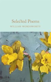
Selected Poems is a collection of Wordsworth’s most acclaimed and influential works, from his best known poem, ‘I Wandered Lonely as a Cloud’, to an extract from his magnum opus The Prelude. A pioneering Romantic poet, Wiliam Wordsworth addressed the natural world and human emotion, and revolutionized poetry.
Poetry of the First World War
by Marcus Clapham
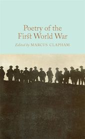
Whether in the patriotic enthusiasm of Rupert Brooke, the disillusionment of Charles Hamilton Sorley, or the bitter denunciations of Siegfried Sassoon and Wilfred Owen, the First World War produced an astonishing outpouring of powerful poetry. This beautiful anthology – edited by Marcus Clapham – features works by the all of the major poets of the time, as well as many others whose voices are less well known, accompanied by contemporary motifs.
The Sonnets
by William Shakespeare
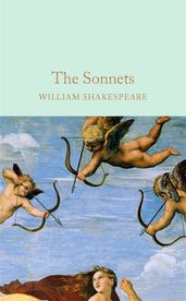
A cycle of 154 linked poems first published in 1609, The Sonnets of William Shakespeare explore many of Shakespeare's most common themes: jealousy, betrayal, melancholy. They ache with unfulfilled longing, and, for many, they are the most complete and moving meditations on love ever written. The first 126 sonnets are addressed to a young man known as the 'Fair Youth', while others are directed at a 'Rival Poet', and a 'Dark Lady' – and each is written in the same beautiful and innovative language that we have come to know from Shakespeare's plays.
Collected Poems
by W B Yeats
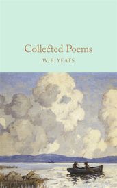
Recipient of the 1923 Nobel Prize for Literature, William Butler Yeats is remembered as one of the major literary figures of the twentieth century and one of Ireland's most beloved poets. His early works include the beguiling 'When You are Old', 'The Cloths of Heaven' and 'The Lake Isle of Innisfree' but his later works, including 'Parnell's Funeral', surpass even those of his youth. All are present in this volume, which reproduces the 1933 edition of W. B. Yeats's Collected Poems.
The Prophet
by Kahlil Gibran
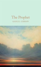
Completely unique and beloved around the world, The Prophet is a collection of twenty-six poetic essays by the Lebanese artist, philosopher and writer Khalil Gibran. It tells the story of the prophet Al-Mustafa and his conversations with various acquaintances as he returns home after a long absence, and touches on subjects of universal concern, including love, friendship, passion, pain, religion and freedom. A vital read for any poetry enthusiast looking for words to soothe the soul.
The best children's poetry books and collections
Pick and Mix Poetry
by Julia Donaldson

A beautiful collection that will inspire a love of poetry in kids of all ages, each poem in Pick and Mix Poetry has been hand-picked by former Children's Laureate and author of The Gruffalo, Julia Donaldson. From learn-by-heart classics to exciting new voices in poetry, and with poems about everything from pirates and pets to school and sweets, every bookshelf and classroom needs a copy of this gorgeous poetry collection.
SLAM! You're Gonna Wanna Hear This
by Nikita Gill
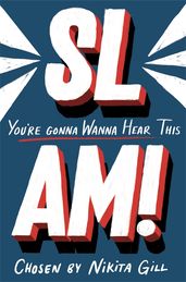
This anthology is a joyful celebration of the groundbreaking performance poets who are making a splash in the world of spoken word. From well-known artists such as Raymond Antrobus and Sophia Thakur to up-and-coming poets, this is the perfect introduction to the world of modern poetry.
A Poem for Every Day of the Year
by Allie Esiri
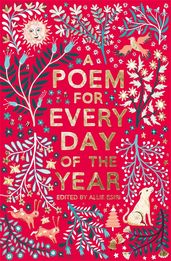
Allie Esiri has complied this wonderful anthology of 366 poems, one to share on every day of the year. Reflections by classic poets sit cheek-by-jowl with the ruminations of new voices, providing an eclectic and inspiring mix of poems exploring the shifting seasons, cultural holidays and more. The collection includes something for everyone. Spanning comedic ditties and gentle meditations, Esiri’s book is perfectly curated for young poetry-lovers. A Poem for Every Night of the Year is a charming companion collection.
‘For the whole family but especially eight-plus readers, A Poem for Every Day of the Year . . . gorgeously presented and intelligently selected.’
— New Statesman
He, She, They, Us
by Charlie Castelletti
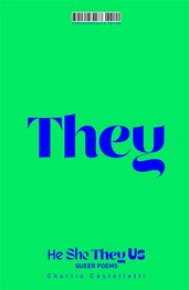
A poetry book like no other, with beautiful endpapers and a reversible cover jacket that allows you to choose your preferred pronoun. The collection pulls together poems from queer poets both old and new to celebrate queerness in all its forms as it takes us through the experiences that make us who we are today. This is the perfect gift or statement piece for any bookshelf, aimed at YA readers and adults.
Poems to Save the World With
by Chris Riddell
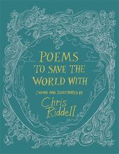
Bringing together an eclectic mix of new poets and old favourites, Chris Riddell’s Poems to Save the World With includes new drum beats to inspire resistance, and familiar rhythms to soothe frayed nerves in a time of turmoil. This beautifully illustrated collection is bursting with inspiration and dedications to building a better world.